Advanced Colour Mixing
Colour mixing goes beyond primary, secondary and tertiary colours. It is all about knowing the combination of colours and the quantity of each colour to get the right effect. The key is to experiment and learn your own ways to achieve the colours you desire.
The colour mixing learnt so far has all been about combining cool yellow, red and blue hues together. You can also get warm hues of these colour to create very different results.
The colour mixing learnt so far has all been about combining cool yellow, red and blue hues together. You can also get warm hues of these colour to create very different results.
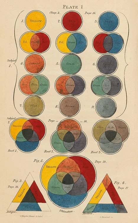
This chart shows how the primary colours make secondary. It then goes a step further, mixing the secondary colours to create olive, brown and slate colours. These can of course can be used with white or black for variation in value. Mixing different quantities of each colour will also provide different results.
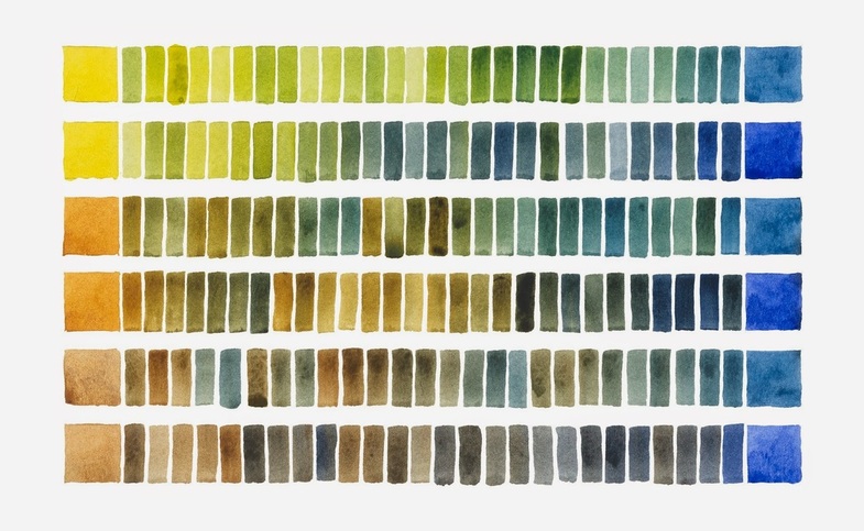
The image above is an example of how two colours can become a whole variety when mixed in with different quantities of those two colours.
Certain paints have higher pigment contents. This changes the way you mix paint. The usual acrylics we use in the classroom have lower pigment contents in the yellow and white colours. This often means that you need more of these colours than the higher pigment colours like black and blue.
If you are trying to mix more realistic colours, try adding grey or white to dull the colour. When using colours straight from the tub they are often very bright. Realistic colours for a traditional landscape or portrait often contain many colours. Eg. a blue, grey, green colour.
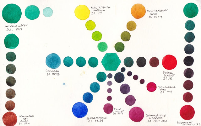
Here you can see that the centre aqua colour has been mixed with the colours on the outer ring of the circle. This creates a whole variety of hues of green and also some purple hues.
Skin colour
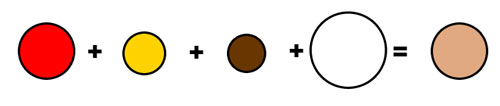
These are the colours I usually use to create a skin colour. You will want a higher quantity of white to the rest of the colours. Try changing the quantities of the other colours to get different hues. Different hues are important for create details like shadows and highlights. You may also need to change the colour depending on the person you are painting and their nationality. (Brown is made by adding a tiny amount of black to red and yellow).
