Design Terms Glossary
A
Adobe
Alignment
The arrangement of image and text in a design, typically from a left, right, central or bottom axis.
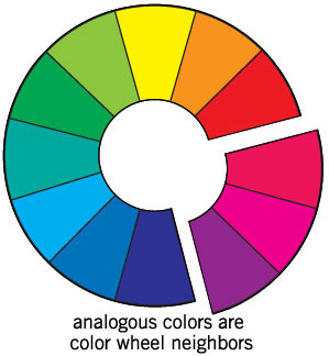
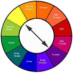
Analogous Colours
Analogous color schemes use colors that are next to each other on the color wheel. They usually match well and create serene and comfortable designs. Analogous color schemes are often found in nature and are harmonious and pleasing to the eye. Make sure you have enough contrast when choosing an analogous color scheme.
Choose one color to dominate, a second to support. The third color is used (along with black, white or gray) as an accent.
Choose one color to dominate, a second to support. The third color is used (along with black, white or gray) as an accent.
|
|
Animation
Generating movement by displaying a series of images using frames.
Architecture
Art/Design Elements and Principles
Asymmetrical
This is when graphics and/or text are not identical on both sides of a central line.
Art/Design Movement
An art/design movement is a tendency or style in art or design with a specific common philosophy or goal, followed by a group of artists/designers during a restricted period of time (usually a few months, years or decades). For example, Art Deco, Bauhaus, Minimalism and Modernism.
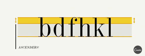
Ascender
Typography - The part of a lowercase letter that extends above the x-height. Some common examples of this are ‘b’, ‘d’, ‘f’, etc.
B
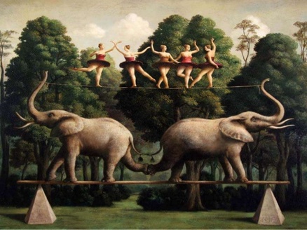
Balance
Balance in art refers to the sense of distribution of perceived visual weights that offset one another. We feel more comfortable and therefore find it more pleasing when the parts of an artwork seem to balance each other
Baseline
Typography - an imaginary line upon which letters sit and descenders extend below the baseline.
Bauhaus
Bleed
When a page or cover design extends to and off the edge of the paper it is called a "bleed."
Blue print
Body Type
Typography - The typeface used in the main text of a printed matter.
Branding
The process involved in creating a unique name and image for a product in the consumers‘ mind, mainly through advertising campaigns with a consistent theme.
Brief
A design brief is a written document for a design project developed concert by a person representing the business need
* Image from Royal High UK
Eg. Brief (the problem): Design a new park bench for a public park.
* Image from Royal High UK
Eg. Brief (the problem): Design a new park bench for a public park.
C
Client
CMYK
Abbreviation for Cyan, Magenta, Yellow and Key colour (black). This color model (also called process color, four color) is a subtractive color model used in color printing.
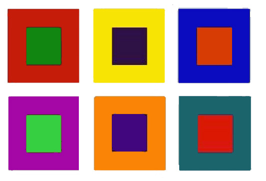
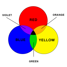
Complementary colours
Colors that are opposite each other on the color wheel are considered to be complementary colors (example: red and green). The high contrast of complementary colors creates a vibrant look especially when used at full saturation. This color scheme must be managed well so it is not jarring.
Complementary colors are tricky to use in large doses, but work well when you want something to stand out.
Complementary colors are tricky to use in large doses, but work well when you want something to stand out.
|
|
Composition
Contrast
Contrast is a principle of art. When defining it, art experts refer to the arrangement of opposite elements (light vs. dark colors, rough vs. smooth textures, large vs. small shapes, etc.) in a piece so as to create visual interest, excitement and drama.
Andreas Kuehn/ Stone/ Getty Images
Creativity
The ability to transcend traditional ideas, rules, patterns, relationships, or the like, and to create meaningful new ideas, forms, methods, interpretations, etc. Originality, progressiveness,or imagination.
This is achieved by experimenting, making mistakes, learning from them, trying different ways to do the same thing and attempting things more than once. Most importantly, creativity is something that can be learnt and is not fixed. You are not born with a certain amount of creativity, it is something you practice.
This is achieved by experimenting, making mistakes, learning from them, trying different ways to do the same thing and attempting things more than once. Most importantly, creativity is something that can be learnt and is not fixed. You are not born with a certain amount of creativity, it is something you practice.
Crop
To select a specific area of an image and cut out (crop) unwanted areas.
D
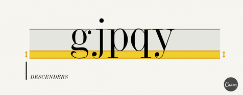
Descender
Typography - The part of a lowercase letter that extends below the x-height. Some common examples of this are ‘g’, ‘j’, ‘p’, etc.
E
Element
Any distinct part of a layout such as the logo, headline, images, or borders.
Ergonomics
F
Fashion Design
Focal Point
In graphic design terms, the focal point is where you want to draw the reader’s or viewer’s eye.
Foreshortening
Seeing an object from an angle is called foreshortening.
Specifically, we define this as, "the compressed appearance of something not perpendicular to us."
Fore means "the front part," indicating that part of the object closest to us. With that in mind, this compressed appearance is achieved by "shortening" those lines which are going from this front part into the distance.
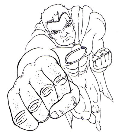
You can see in this example the mans fist is much bigger than the rest of his body. This is because it is in the 'fore,' or front. The rest of his body gets smaller as he recedes into the background or vanishing point. This means that his feet become the smallest part of his body, when in reality we know this isn't true. When done correctly and in proportion, this method creates the illusion of depth.
Form and Function
Form follows function is a principle associated with modern architecture and industrial design in the 20th century. The principle is that the shape of a building or object should be primarily based upon its intended function or purpose.
Furniture Design
G
Geometric
Geometric is something associated with geometry, or the use of straight lines and shapes. An example of geometric is an artpiece made from rectangles, squares and circles. Geometry was highly used by the Cubist artists such as Picasso.
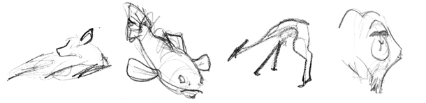
Gesture Drawing
Usually refers to a drawing which is created in a 'loose' manner. The lines are laid down quickly and create the general impression of the figure. This is good for the initial design phase to get ideas down quickly.
Graphic Design
Visual communication using text or images to represent an idea or concept. It is also a term used for all activities relating to visual design, including web design, logo design, etc.
Grayscale
Grayscale images consist of black, white, no color, and up to 256 shades of gray.
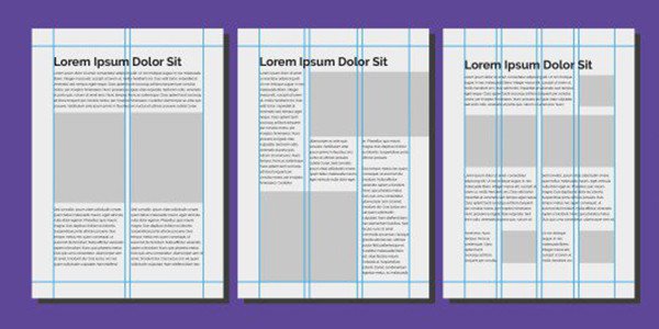
Grid
Invisible lines imposed on a layout that help to bring coordination by providing guides for alignment and scale. Is a two-dimensional format made up of a set of horizontal and vertical axes used to structure content.
H
Haute couture
The term "haute couture" is French. Haute means "high" or "elegant." Couture literally means "sewing," but has come to indicate the business of designing, creating, and selling custom-made, high fashion clothes.
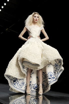
Christian Dior spring 2009
Headline
Typography - A large text illustrating the opening statement used in a layout.
Hierarchy
The arrangement of elements to guide viewers through them in a specific order. The visual arrangement of design elements in a way that signifies importance. For example, you might make a title big and bold to ensure it attracts more attention than a small, lightly colored image caption.
Highlights
Lightest part of a photograph or halftone, as opposed to mid-tones and shadows.
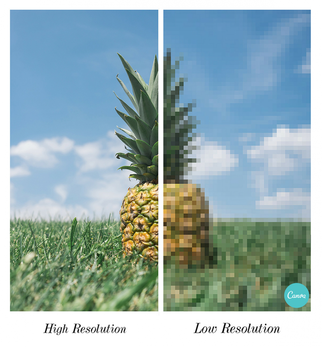
High-Resolution Image
An image with an extreme level of sharpness/clarity.
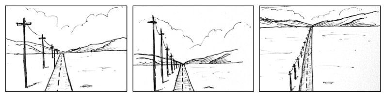
Horizon Line
The horizon line in perspective drawing is a horizontal line across the picture. It is always at eye level - its placement determines where we seem to be looking from - a high place, or from close to the ground. The actual horizon might not be visible, but you need to draw a 'virtual' horizon to construct a picture in perspective.
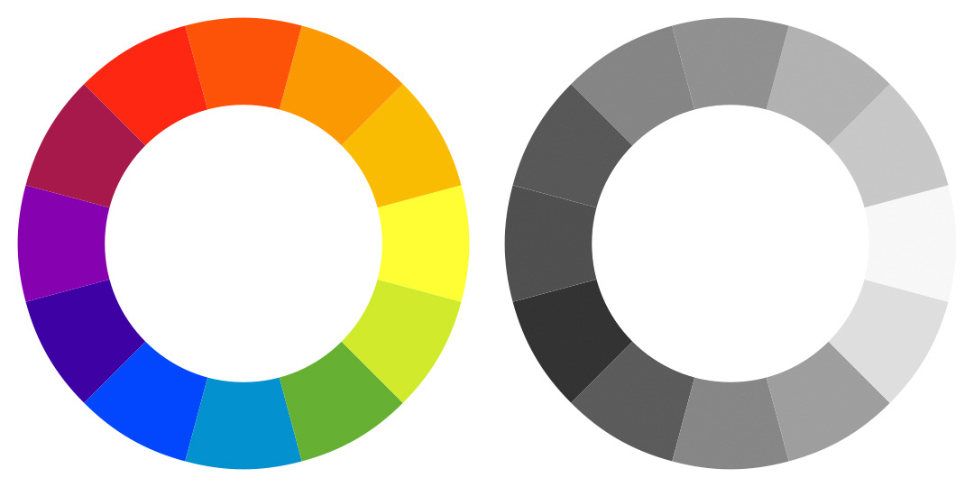
Hue
One of the three primary attributes of color. A hue is a variety of color such as red, blue, green, or yellow.
I
Interface
Illustration
Italic
Typography - The style of letters that usually slope to the right. Used for emphasis within text.
J
JPEG (Joint Photographic Electronic Group)
A file name for a common process for compressing digital images.
Justify
Typography - to make a line of type a certain length by spacing out the words and numbers.
K
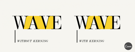
Kerning
Typography - The adjustment of space between two characters in your type. Kerning usually aims to achieve a more proportional and pleasing balance of space between each character.
L
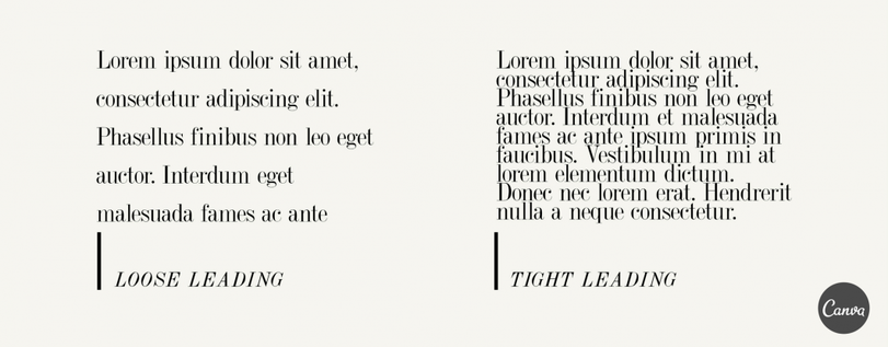
Leading
Typography - Pronounced ‘ledding’, leading refers to the space between lines of type. Overly tight leading can cause tension and overlap, making the content unreadable, and too-loose leading can equally make the type appear disjointed, so we usually try to find a nice balance between the two.
Legend
A table inside a project that lists vital illustrations or instructions; footnote that helps users better understand information.
Letterform
Typography - refers to each letter as an individual form
Letterpress
A technique of printing where movable type is inked and then pressed against paper to create an impression. Also called block printing.
Line
A line is an identifiable path created by a point moving in space. It is one-dimensional and can vary in width, direction, and length. Lines often define the edges of a form. Lines can be horizontal, vertical, or diagonal, straight or curved, thick or thin, scribbly or flowing etc.
Logo
Lower Case
Typography - the smaller form of letter used in type.
M
Mark-making
The process of applying pen or pencil to paper; the character of marks made by different implements or technological effects.
Matte Finish
Non-glossy finish on photographic paper or coated printing paper.
Medium
A medium refers to the materials that are used to create a work of art. The plural of medium is media. Some examples of media are oil, acrylic or watercolour paints, graphite, metal, clay, fabric etc.
Modern
Typography - An altered version of Old Style. these high-contrast letters have heavy, untapered stems and light serifs. Originally established by Firmin Didot and Giambattista Bodoni during the late 18th to early 19th centuries.
Monochrome
'Mono' means one and 'chrome' means colour. In relation to art, a monochrome artwork is one that includes only one colour. Often these artworks include different values and hues of the same colour.
Monogram
Mood Board
Multimedia
Offering the use of various communications such as text, sound, and still or moving images.
N
Negative Space
Also known as white space. The area of a page that doesn’t contain images or words.
O
Oblique
Typography - A Roman typeface which slants to the right. Often confused with italics.
Old Style
Typography - A style of type characterized by slight contrast between light and heavy strokes and slanting serif.
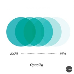
Opacity
The degree of a color or tonal value. The opacity of an image or object that can range from transparent (0% opacity) to opaque (100% opacity). The ability to edit the opacity of specific objects allows the designer to create images that seem to flow into and through one another.
Oriental
Of, from, or characteristic of Asia, especially East Asia.
For example, in traditional Japanese art, they often used restrained colour palettes. Certain colours in an artwork may give an 'oriental aesthetic.'
It is not a replacement term for the word 'Asian' and should not be used to describe people.
For example, in traditional Japanese art, they often used restrained colour palettes. Certain colours in an artwork may give an 'oriental aesthetic.'
It is not a replacement term for the word 'Asian' and should not be used to describe people.
P
Packaging Design
Page Layout
Deals with the setup and style of content on a page. An example of a page layout is the pages in magazines or brochures.
Palette
The selection of colors that you choose to use for your design.
Pattern
Fashion and dressmaking
Stands for Portable Document Format. Developed by Adobe Systems in its software program, Adobe Acrobat, to serve as a universal browser. Files can be downloaded over the web and viewed page by page, provided the user’s computer has installed the application.
Perspective
Perspective in drawing or painting, is a way of portraying three dimensions on a flat, two-dimensional surface by suggesting depth or distance.
There are multiple ways of drawing perspective:
In one point perspective, only one vanishing point is needed because the sides of all objects are moving away from us in the same one direction.
Two point perspective is just like one point. However by using 2 points, it allows you to create a more realistic sense of space and depth within an artwork. A drawing has two-point perspective when it contains two vanishing points on the horizon line. In an illustration, these vanishing points can be placed arbitrarily along the horizon. Two-point perspective can be used to draw the same objects as one-point perspective, rotated: looking at the corner of a house, or at two forked roads shrinking into the distance, for example. One point represents one set of parallel lines, the other point represents the other. Seen from the corner, one wall of a house would recede towards one vanishing point while the other wall recedes towards the opposite vanishing point.
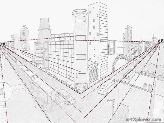
Three point perspective
Three-point perspective is often used for buildings seen from above (or below). In addition to the two vanishing points from before, one for each wall, there is now one for how the vertical lines of the walls recede. For an object seen from above, this third vanishing point is below the ground. For an object seen from below, as when the viewer looks up at a tall building, the third vanishing point is high in space.
There are multiple ways of drawing perspective:
In one point perspective, only one vanishing point is needed because the sides of all objects are moving away from us in the same one direction.
Two point perspective is just like one point. However by using 2 points, it allows you to create a more realistic sense of space and depth within an artwork. A drawing has two-point perspective when it contains two vanishing points on the horizon line. In an illustration, these vanishing points can be placed arbitrarily along the horizon. Two-point perspective can be used to draw the same objects as one-point perspective, rotated: looking at the corner of a house, or at two forked roads shrinking into the distance, for example. One point represents one set of parallel lines, the other point represents the other. Seen from the corner, one wall of a house would recede towards one vanishing point while the other wall recedes towards the opposite vanishing point.
Three point perspective
Three-point perspective is often used for buildings seen from above (or below). In addition to the two vanishing points from before, one for each wall, there is now one for how the vertical lines of the walls recede. For an object seen from above, this third vanishing point is below the ground. For an object seen from below, as when the viewer looks up at a tall building, the third vanishing point is high in space.
Photography
Photography is the act of taking photographs. This can be done through technology such as a camera or phone. There are many different types of photography from daguerreotype to pin hole cameras to digital. There is a debate whether photography can be considered art or if it is simply an act of documentation. However, with the wide range of experimentation open to photographers this debate is not as relevant as it once was. What do you think the answer might be?
Pixel
The smallest picture content that can be individually assigned a color.
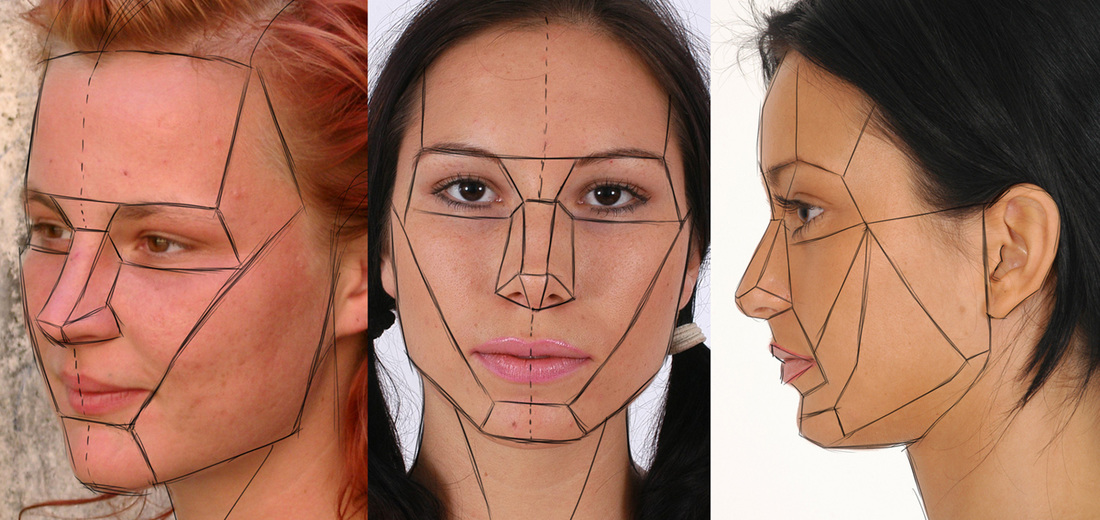
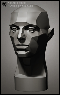
Planes of the face.
The planes of the face help you in many ways. It helps you by creaking down the face into basic shapes.
Every face is unique. By breaking it down you can see individual characteristics to help you achieve more 'likeness' of the person you are painting/drawing.
Angle - it can help you figure out the proportions of the face when it is on different angles. By placing the face on an angle you can create a more natural or relaxed sense to the artwork.
Tone - you can see where the different values fall.
|
|
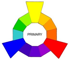
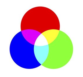
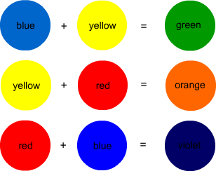
Primary Colours
A group of colours from which all other colours can be obtained by mixing.
|
|
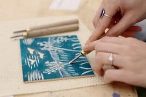
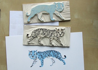
Printmaking
The art or technique of making prints, especially as practiced in engraving, etching, drypoint, woodcut or serigraphy. The image below shows a piece of wood being carved. This creates a printing block. The tiger image displays the printing blocks used to create the tiger image underneath, which is the print itself.
|
|
Problem Solving
Product Design
Proportion
Proportion refers to the relative size and scale of the various elements in a design. The issue is the relationship between objects, or parts, of a whole.
Proximity
R
Repetition
Resolution
The resolution of an image is an important factor in deciding the attainable output quality. The higher the resolution of an image, the less pixelated it will be and the curves of the image will appear smoother.
RGB
Abbreviation for red, green, blue. The three primary colours of light used to create all colours on a screen. (Method for mixing colours on a computer screen similar to red, blue and yellow primary colours with paint)
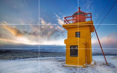
Rule of Thirds
Rule of Thirds is a theory that if you divide your image with two vertical and two horizontal lines, the areas where your lines intersect will become focal points of your design.
S
Sans Serif
Typography - A style of typeface that means “without feet.” Usual sans serif typefaces include Arial, Helvetica, AvantGarde, and Verdana. Sans serifs tend to look more modern, stylish, and cleaner than their serif counterparts.
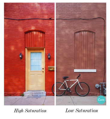
Saturation
The intensity of hue. The quality of difference from a gray of the same lightness or brightness.
Scale
The change of size of an object while keeping its shape and proportions in tact. Large scale can create drama, and smaller scale can create fine detail.
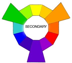
Secondary Colours
A color produced by mixing two additive primary colors in equal proportions.
|
|
Selection
Selection refers to an area of an image that is isolated so it can be edited while the rest of the image is protected.
Serif Typeface
Typography - A typeface with small decorative strokes (called ‘serifs’) found at the end of horizontal and vertical lines. Serif typefaces tend to look professional, authoritative, and traditional in appearance.
Space
Symbol
A distinctive symbol or mark that represents a product; generally works with a name style.
T
Target Audience
Terminal
Typography -
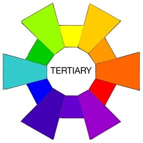
Tertiary Colours
Tertiary colors are the resulting color formed when an equal amount of a primary and a secondary color are mixed. The primary and secondary color must be beside each other on the color wheel. For example, a mixture of 50-percent red and 50-percent magenta would result in the tertiary color of orange
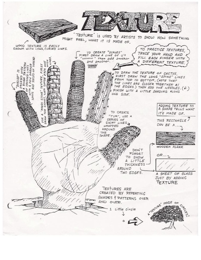
Texture
Texture, another element of art, is used to describe either the way a three-dimensional work actually feels when touched, or the visual "feel" of a two-dimensional work.
Thumbnail
Small rough visuals/sketches that incorporate sufficient detail and accuracy to be of value for decision making. Thumbnails are usually used when brainstorming and generating ideas as they are a quick way to get many ideas down fast.
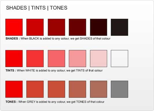
Tint
Tints, shades and tones help to create more realistic paintings and artworks as they provide a wider variety of colour. With the colour red (shown below) you can achieve a whole range of reds just by adding white or black to the red paint.
This is the same as Value.
This is the same as Value.
|
|
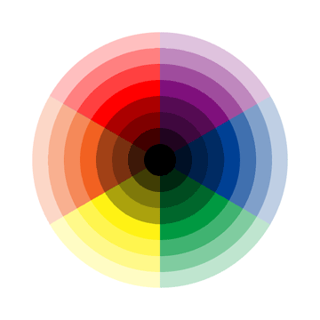
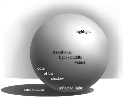
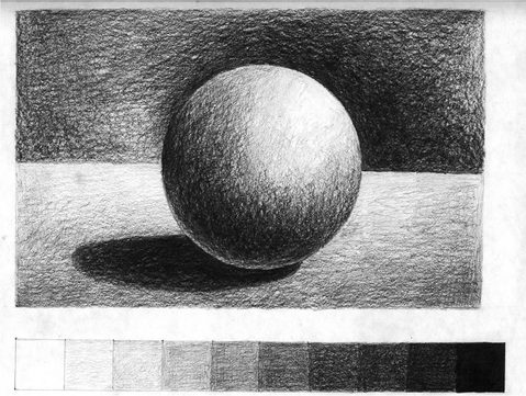
Tone
This refers to the lightness or darkness of something. This could be a shade or how dark or light a colour appears. Tones are created by the way light falls on a 3D object. The parts of the object on which the light is strongest are called highlights and the darker areas are called shadows.
Below is an example of how light would reflect off a sphere. This is all dependant on the light source. In this case the light is coming down from the top right of the object. The shadows and values would change if the light was pointing in a different direction. For example, if the light was underneath the object, the values would be reversed so that the highlight would be at the bottom. The middle values (mid tones) are in the middle and the shadow is at the top.
Advanced tip: A common mistake is to create the bottom of the sphere as the darkest colour. However for a more realistic effect this should be a mid tone as some light is reflected off of the surface of the table (base), back onto the sphere.
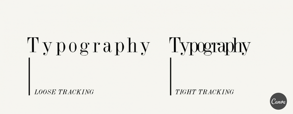
Tracking
Typography - Tracking concerns the space between letters. When we track bodies of text, we are adjusting space between every letter in a word in order to change the density or appearance of a large block of type (i.e. body copy). Tracking shouldn’t be confused with kerning, which concerns the adjustment of space between individual pairs of letters.
Typeface
Typography - A typeface consists of a series of fonts and a full range of characters such as, numbers, letters, marks, and punctuation.
Typographic Weight
The thickness or thinness of letterforms creating different degrees of bold, medium or light type.
Typography
The art of arranging type—which includes letters, numbers, and symbols—so that it is pleasing to the eye. This includes not only the font that is used but how it is arranged on the page: letter by letter, size, line spacing, etc.
U
Uppercase
Typography - Also known as capital letters, they are the larger characters in a typeface.
V
Value
Value refers to the lightness or darkness of a colour. As you can see in the first example below, the brightest yellow has the lightest colour value. While the blue-purple has the darkest value.
It is good to use a range of values when creating an artwork. (Remember there are no rules, but this will give a more realistic or dramatic effect.)
If you have create an artwork and you think it looks 'flat' or there is 'something missing.' Try taking a photo of it and using photoshop to change it to black and white. You will be able to see the values more clearly and can then adjust some areas so there are brighter highlights and darker shadows for a more dramatic effect. (If this is desired of course.)
|
|
W
Watermark
Translucent design impressed on paper created during manufacture, it is visible when held to light.
Weight
Typography - the range of a stroke’s width. Also knows as semi-bold, light, and bold. Some typeface families have many weights like ultra-bold and extra-light. Associated to the heaviness of the stroke for a specific font, such as Light, Regular, Book, Demi, Heavy, Black, and Extra Bold.
X
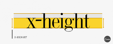
X-height
Typography - the average height of lowercase letters. X-height gets its name as this value is usually exemplified by looking at the height of the letter x in any given typeface.