Practical Assessment Task 30%
For a 10-credit subject, students produce one or two practicals, one of which must be a resolved work. One may be a minor work completed in preparation for a major resolved work, or one minor work and one major resolved work, which may or may not be linked. Programs with one practical must focus on a major resolved work.
A work of art or design may be a single resolved practical or a body of resolved work.
Art practicals may take any of the following forms: film, animation, installation, assemblage, digital imaging, painting, drawing, mixed media, printmaking, photography, fabrication (wood, plastic, or metal), sculpture, ceramics, and/or textiles.
Design practicals may be categorised in the broad areas of product design, environmental design, graphic design, or visual communication.
Practicals must be:
Practical Assessment Criteria
Practical Application
The specific features are as follows:
A work of art or design may be a single resolved practical or a body of resolved work.
Art practicals may take any of the following forms: film, animation, installation, assemblage, digital imaging, painting, drawing, mixed media, printmaking, photography, fabrication (wood, plastic, or metal), sculpture, ceramics, and/or textiles.
Design practicals may be categorised in the broad areas of product design, environmental design, graphic design, or visual communication.
Practicals must be:
- as high a quality as possible in craftsmanship
- attempt to communicate an idea / message / concept / function
- connect to the folio/s created
Practical Assessment Criteria
Practical Application
The specific features are as follows:
- PA1 Conceptualisation and development of imaginative or personally relevant visual ideas.
- PA4 Application of technical skills with media, materials, and technologies to communicate visual ideas in resolved work(s) of art or design.
Practitioners Statement
The Practitioner’s Statement 250 words
For a 10-credit subject, students prepare a written practitioner’s statement for one resolved practical. Each practitioner’s statement should be a maximum of 250 words.
A practitioner’s statement for art practical work should include:
For a 10-credit subject, students prepare a written practitioner’s statement for one resolved practical. Each practitioner’s statement should be a maximum of 250 words.
A practitioner’s statement for art practical work should include:
- art terminology throughout
- a description of starting points and influences - artists, art / design movements, methods and techniques, other areas that inspired you, etc.
- an explanation of the intended meaning or message of the practical work or works
- the student’s evaluation of his or her own practical work or works.
A suggested structure:
Introduction:
Topic sentence: What is your artwork about? What is the concept? Where there any major influences?
Body:
Evaluation
Introduction:
Topic sentence: What is your artwork about? What is the concept? Where there any major influences?
Body:
- Influences from artists, art movements, cultures and or society.
- Experimentation with media.
- Any important compositional decisions.
Evaluation
- Does your artwork communicate your intended message? Explain, why or why not.
- Is it effective in composition? Is it pleasing to the eye? Does it have a mood? Do all of these things help the intended meaning?
- Was there anything that you could improve? Explain, why or why not.
Student Examples:
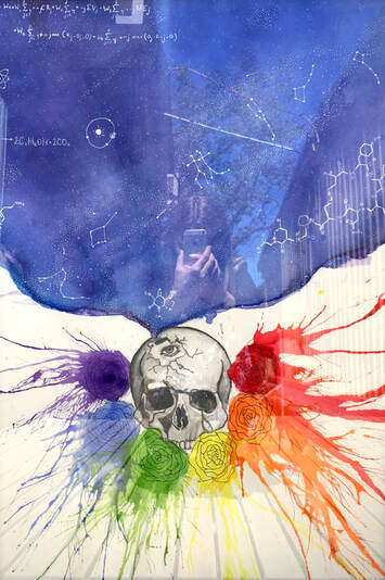
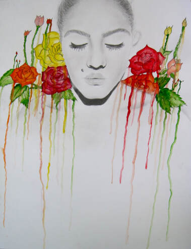
Watercolour and graphite
Practitioners Statement:
In this piece I used the galaxy and the scientific diagrams to show my love of science and the universe as a whole. This also shows the logical, analytical, and deep thinking side of my personality. The roses and the bright colors are there to show my love of art and creativity, as well as my bright, cheerful, and happy nature. Both of these aspects come from the skull, which represents me. The skull is black and white so as to depict how I am supposed to be according to society- logical OR creative, scientific OR artistic. The eye is society, always judging, always watching, as well as its monochromatic expectations of me. I believe that the piece is successful, as it includes all the traits and aspects of my personality that I wanted to include, and it is aesthetically pleasing. The piece is quite similar to what I aimed for it to be, and I am pleased with how it looks.
In this piece I used the galaxy and the scientific diagrams to show my love of science and the universe as a whole. This also shows the logical, analytical, and deep thinking side of my personality. The roses and the bright colors are there to show my love of art and creativity, as well as my bright, cheerful, and happy nature. Both of these aspects come from the skull, which represents me. The skull is black and white so as to depict how I am supposed to be according to society- logical OR creative, scientific OR artistic. The eye is society, always judging, always watching, as well as its monochromatic expectations of me. I believe that the piece is successful, as it includes all the traits and aspects of my personality that I wanted to include, and it is aesthetically pleasing. The piece is quite similar to what I aimed for it to be, and I am pleased with how it looks.
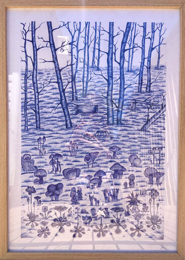
Pen on paper
Practitioners Statement:
Inspiration was gathered from my personal tendency of making from my emotions which deeply impact me, and my strong desire to focus on a subject I haven’t experimented with, in this case landscape and reality drawing. The use of blue and white was inspired by crockery and artist Danie Mellor.
My intention was to create a drawing pleasing to my aesthetic. This is expressed through the use of blue and white by the pens to create an artwork in a monochromatic colour scheme. I use depth to create a visual view of real landscape, line weight to create the texture on image. I used the Adelaide Hills Book of local native flora to draw the native insect catchers and fungi. The balance between the trees and the groundcover represent the beauty of different nature in the Adelaide Hills; I wish to keep experiencing them. I found a wooden frame to present the artwork as it looks natural to fit with the theme.
My final artwork has successfully communicated my intended style and it allows me to show the nature of the Adelaide Hills and the art themes from my artist research. My piece has created a pleasing texture, but the use of the depth was not quite there yet, I should play with depth more to make my artwork more realistic. My use of blue and white helps to represent the negative and positive space, while the blending on the lines achieved a realistic effect on my final artwork.
|
|
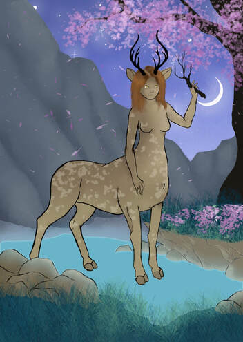
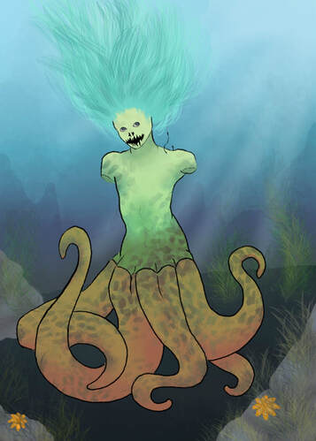
Digital illustrations
Practitioners Statement:
My final pieces were heavily influenced by the artist Andrea Koroveshii, the four elements, and Greek mythology. Each piece was a different element and a different creature that went along with it; these were: lampad (fire), Siren (water), harpy (air), and centaur (earth). When choosing the creatures to put in my pieces I wanted to have them have something human about them. This is because I wanted to how show how people are affecting the world/ how people are a big part of the world. I found that the only culture that I really like that was like this was Greek mythology. While I was creating these creatures, I put my own spin on them. A good example of this was the siren that I did. I didn’t want to just do a tail, so I made it an octopus bottom half. I found it quite difficult having to change/ learn a different art style in such a short amount of time. I incorporated the glow/ bright colours into my own pieces. I found four pieces in particular that I really liked that I wanted to gain inspiration from. Due to the small-time frame I could only complete two of the four pieces that I wanted to complete, these were water and earth. I decided these two because I found that I would be able to incorporate Andrea Koroveshiis style easier compared to the other two elements.
My final pieces were heavily influenced by the artist Andrea Koroveshii, the four elements, and Greek mythology. Each piece was a different element and a different creature that went along with it; these were: lampad (fire), Siren (water), harpy (air), and centaur (earth). When choosing the creatures to put in my pieces I wanted to have them have something human about them. This is because I wanted to how show how people are affecting the world/ how people are a big part of the world. I found that the only culture that I really like that was like this was Greek mythology. While I was creating these creatures, I put my own spin on them. A good example of this was the siren that I did. I didn’t want to just do a tail, so I made it an octopus bottom half. I found it quite difficult having to change/ learn a different art style in such a short amount of time. I incorporated the glow/ bright colours into my own pieces. I found four pieces in particular that I really liked that I wanted to gain inspiration from. Due to the small-time frame I could only complete two of the four pieces that I wanted to complete, these were water and earth. I decided these two because I found that I would be able to incorporate Andrea Koroveshiis style easier compared to the other two elements.
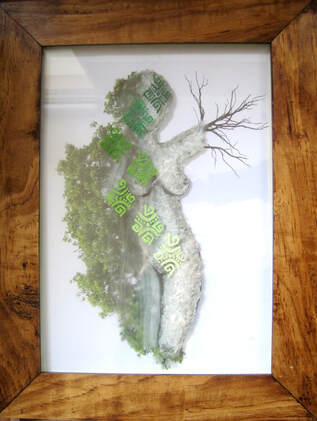
Digital photo manipulation and glass layered on top with paint in-between two glass layers.
|
|
Digitally manipulated photographs
Pencil and watercolour paint
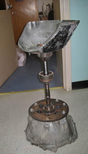
Found metal items
