Typography
Typography is the art of creating letterforms and creating the spacing for letterforms to create a typeface.
A typographer is someone who creates a typeface, it is a very involved and complex process. Understanding type is an essential part of becoming a designer.
Below is an example of how a typeface can be constructed. Not all type is constructed in the same way, but this gives you some of the usual terms used in creating a typeface.
Anatomy of Type
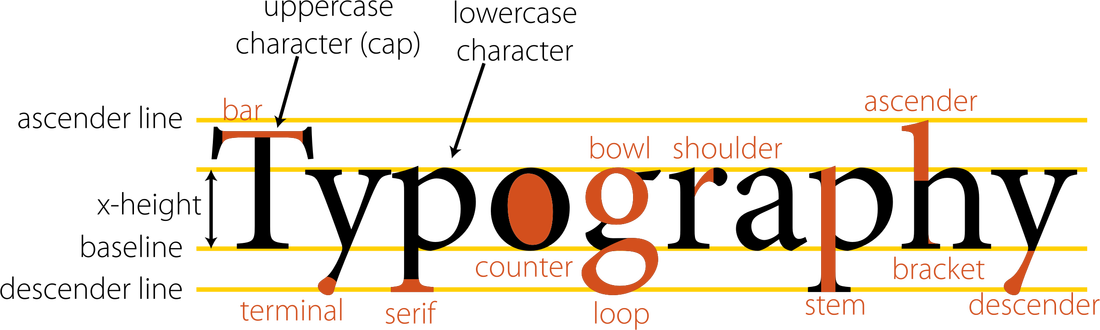
The main thing to learn from this example of anatomy is the x-height.
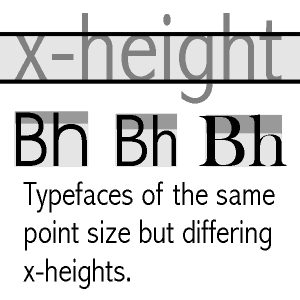
Definition: In typography, x-height is the distance between the baseline of a line of type and tops of the main body of lower case letters (i.e. excluding ascenders or descenders). The x-height is a factor in typeface identification and readability.
In typefaces with small x-heights, other letter parts such as ascenders and descenders may become more visually noticeable. These typefaces tend to be easier to read. Therefore they are good for large bodies of text.
Typefaces with large x-heights may appear darker, heavier, crowded, and more difficult to read at body copy sizes.
If changing to a typeface with a smaller x-height is not an option, open up the lines of type by adding more leading (line spacing), and not using fully justified alignment. Sans Serif typefaces typically have large x-heights.
Readability - this is extremely important. As a designer it is your job to choose which typefaces to use. You have the choice of function or form. How important is the appearance over how important it is to be able to be read. This will differ depending on what you are designing, for example a book compared to a poster.
The readability is determined by many factors. A lot of typography has to do with contrast. The relationship between positive and negative space. For example:
The visual weight of a typeface is determined by the x-height. The larger the x-height the more 'weight' the text will have on a page. The smaller the x-height the less 'weight.'
The letterforms themselves are made up of strokes. These can vary in thickness, changing the space and weight of a typeface.
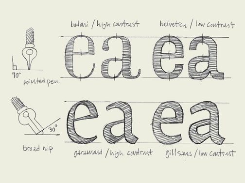
Example of line weight, stroke and contrast
Where did written words come from?
Language and verbal communication were around a long time before the written word as we know it today.
Communication and history were recorded through story telling. All cultures evolved this way.
The written word has evolved from two main areas, from Egypt and Mesopotamia. To begin with writing was very representational. In other words, the words looked like what they were describing. A picture of a bull represented a bull. These are called symbols. This way of writing was useful for conveying nouns, however the need for more abstract concepts saw the evolution of language to abstracted forms.
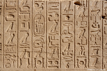
An example of symbols and early writing your may be familiar with is hieroglyphs.
Communication and history were recorded through story telling. All cultures evolved this way.
The written word has evolved from two main areas, from Egypt and Mesopotamia. To begin with writing was very representational. In other words, the words looked like what they were describing. A picture of a bull represented a bull. These are called symbols. This way of writing was useful for conveying nouns, however the need for more abstract concepts saw the evolution of language to abstracted forms.
An example of symbols and early writing your may be familiar with is hieroglyphs.
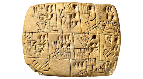
Cuneiform is a system of writing first developed by the ancient Sumerians of Mesopotamia c. 3500-3000 BCE
After symbols, the first written language came from the Middle East.
After symbols, the first written language came from the Middle East.
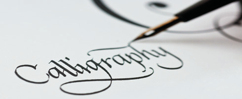
Calligraphy
Calligraphy is the art of forming beautiful symbols by hand and arranging them well. We will be looking at calligraphy as it helps us to understand where type as we see it today began and in understanding the nuances with a typeface.
We will be looking in particular at the contrast of thick and thin strokes and practising the basic anatomy of type.
We will be looking in particular at the contrast of thick and thin strokes and practising the basic anatomy of type.
Example of a calligraphy pen
|
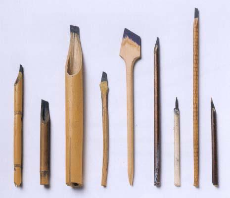
Anything can be used as a calligraphy pen. The main thing is that the nib has a wide and skinny side. The width can vary to provide different results.
|
Printing
Types of Type
Each typeface has it's own story to tell. As a designer it is important to understand how the background history impacts the communication of a design.
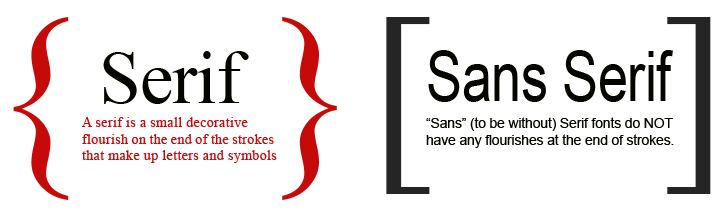
Serif
Old style typefaces
are an important component of every good typeface library. Originally created between the late 15th and mid-18th centuries, these early roman types are characterised by curved strokes whose axis inclines to the left, and little contrast between thick and thins.
are an important component of every good typeface library. Originally created between the late 15th and mid-18th centuries, these early roman types are characterised by curved strokes whose axis inclines to the left, and little contrast between thick and thins.
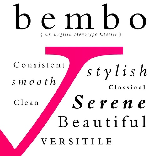
Bembo is an old style serif. It has strong calligraphic flavour, tilted axis, bracketed serifs and a small x-height.
It is associated with literature, classicism and the Middle ages.
It is associated with literature, classicism and the Middle ages.
Transitional
A greater contrast between thick and thin stokes. Wider, gracefully bracketed serifs with flat bases.
A greater contrast between thick and thin stokes. Wider, gracefully bracketed serifs with flat bases.
Modern
Stark and mechanical forms paralleled the ideas of the European age of enlightenment. There was anew interest in empiricism, rationality and scientific rigour.
The first true rationalist typeface was the Roman du Roi or Kings Roman, which was mathematically designed.
Stark and mechanical forms paralleled the ideas of the European age of enlightenment. There was anew interest in empiricism, rationality and scientific rigour.
The first true rationalist typeface was the Roman du Roi or Kings Roman, which was mathematically designed.
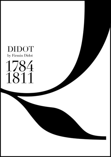
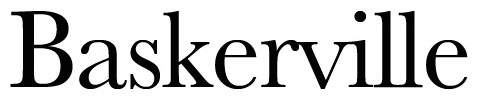
Influenced by the typeface Baskerville, Didot is associated with fashion.
Egyptian style
typefaces were a new age for typography. Type was no longer just in books, it was also on products, posters and newspapers.
It was a time of experimental typographic forms such as fat faces, sans serifs, 3D type and type with patterns and ornaments. These varying typefaces were often combined in eclectic compositions, designed to 'shout' their message as loudly as possible.
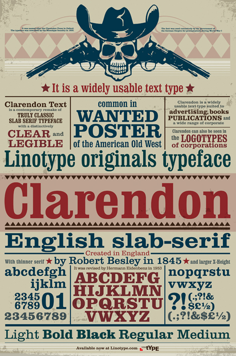
Clarendon was created in 1845 by Robert Besley. It is associated with the Victorian era, industrialism, spectacle and ornament.
Sans Serif
Grotesque
By the end of the 50s the market was ripe for a new, cleaner sans serif typeface. That would work with the increasingly popular swiss style of graphic design. These typically have large x-heights and low modulation.
By the end of the 50s the market was ripe for a new, cleaner sans serif typeface. That would work with the increasingly popular swiss style of graphic design. These typically have large x-heights and low modulation.
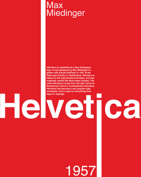
Helvetica is a neo grotesk or rational sans serif. It dominates the corporate typographic landscape. It is literally all around us. It has become a default typeface for signage and often used on interfaces such as phones.
Geometric
In the early 19th century there was a lot of change in technology. In art traditions were being questioned and artists were stripping their work back to the basics of colour, shape and form. This approach also applied to type design. The result was a radical break from the 400 year evolution of typographic forms.
In the early 19th century there was a lot of change in technology. In art traditions were being questioned and artists were stripping their work back to the basics of colour, shape and form. This approach also applied to type design. The result was a radical break from the 400 year evolution of typographic forms.
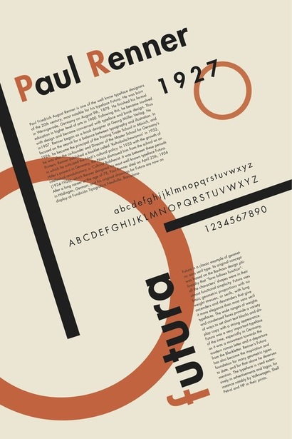
Futura is associated with simplicity, transparency and sometimes naivety. It is an early European Modernist type.
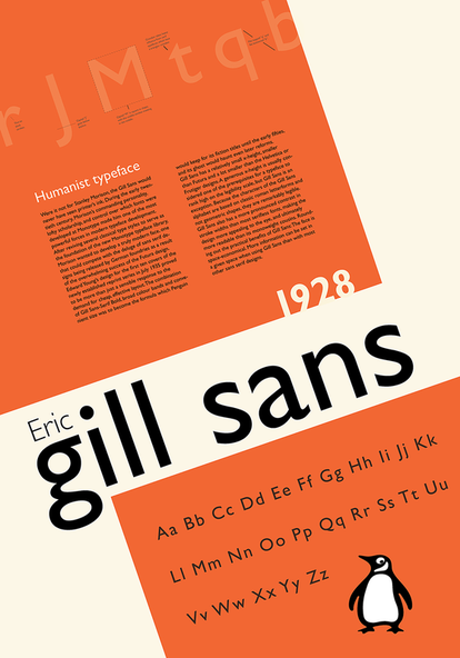
Humanist
Showing signs of handwriting or pen strokes. Some variation of thick and thin. These typefaces are generally 'warmer' in feel than the very structured geometric designs previously seen in sans serif fonts.
Showing signs of handwriting or pen strokes. Some variation of thick and thin. These typefaces are generally 'warmer' in feel than the very structured geometric designs previously seen in sans serif fonts.
Now play the game 'I shot the serif' to test out your knowledge of serif and sans serif fonts. Don't forget to listen to Eric Clapton as you play!
Key Words:
- Typeface
- Serif and Sans Serif
- x-height
- Spacing
- Visual Weight
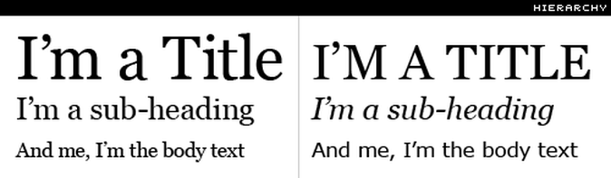
Visual Hierarchy
Typographic hierarchy is a system for organizing type that establishes an order of importance within the data, allowing the reader to easily find what they are looking for and navigate the content
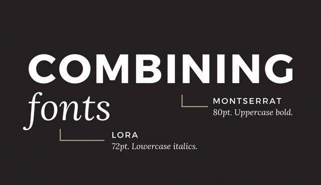
Combining Typefaces
When combining typeface the trick is to balance the contrast with consistency.
Choose typefaces that are stylistically different, not similar to each other. For example you might couple a serif with a sans serif. This brings contrast.
However, try to choose type that is consistent to bring a sense of unity. Look for types that have similar proportions. Start by comparing the x-height and try to make it as similar as possible or the same. Then compare the shapes of the letters like the Os and Gs.
It's all about balancing the contrast and consistency.
Some typographers have created typefaces that match and work well together. These are ready for you to use, you just need to do a bit of research to find out which typefaces they are. An example is Scala and Scala Sans.
Another contributing factor that is important to your choice of typeface is the associations we already have with particular typefaces. Typography has an in-depth history, understanding that history will help you to choose the best typeface for your design.
Creative Typography
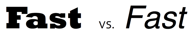
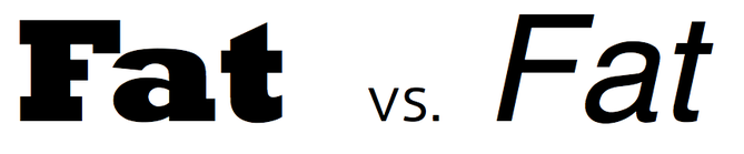
The type you use can portray a message through interpretation and emotion. The relationship between what words say and what their typographic form is, is really important. It is a way to create a message for your audience.
Remember, type is about communication.
You read words, but you also read form.
Remember, type is about communication.
You read words, but you also read form.
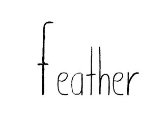
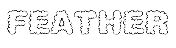
What adjectives (descriptive words) would suit your object from the image making task? For example, Fluffy Feathers or Sleek Feathers.
1. Choose 4 adjectives.
2. Create a font that helps to show the meaning of that adjective.
When writing the name of your object, does the typeface designed/chosen communicate the meaning of the adjective well?
1. Choose 4 adjectives.
2. Create a font that helps to show the meaning of that adjective.
When writing the name of your object, does the typeface designed/chosen communicate the meaning of the adjective well?
Fluffy:
Delicate: