Form
Tone is used to create the illusion that the object you are drawing is three dimensional.
1. Value plays a large part in this and we will create a value scale to emphasise this.
2. You will be drawing a series of shapes such as circles and squares and turn them into forms, ie. sphere and cube, by applying value and tone.
The main idea behind tone is that you are drawing how the light hits an object. Where a lot of light is hitting an object we leave it white, this is called a highlight. if there is some light hitting the object we add some shading, mid tone, if there isn't much light hitting a part of the object we shade this in darker, dark tone. Lastly an object will cast a shadow, depending on how much light will depend how dark the shadow is, there are many types of shadows!
Examples of different forms with tone
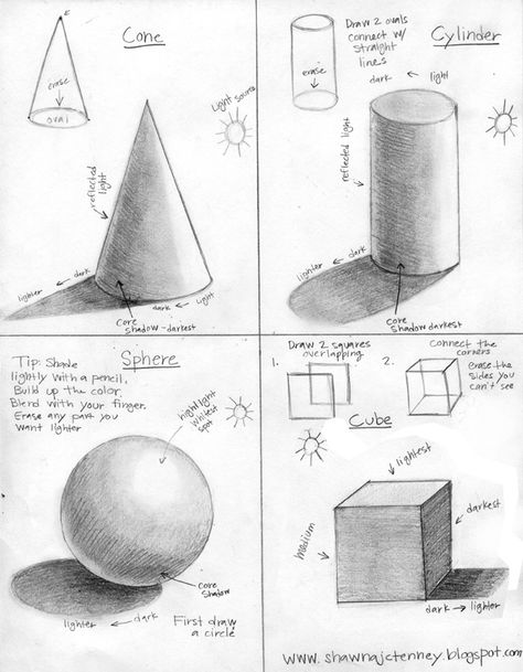
Notice how the forms are made with line and then made solid with tone.
Each form reacts differently when light hits it, remember, if you changed the direction of the light source, you would apply the tone differently from these sketches. For examples, if your light source was coming from underneath the forms, you highlights would be on the bottom of the forms with the dark values and shadows at the top.
Each form reacts differently when light hits it, remember, if you changed the direction of the light source, you would apply the tone differently from these sketches. For examples, if your light source was coming from underneath the forms, you highlights would be on the bottom of the forms with the dark values and shadows at the top.
Good example of tone and value with high contrast
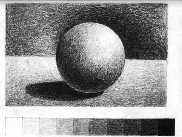
Look at the high amount of contrast in this sketch. This is due to using the full value range from the lightest white to the darkest black. There is a good range of mid tones in-between which helps the sphere to look smooth and round. The background is darkest behind the white highlight emphasising the contrast.
Notice the little white strip between the shadow and sphere. This is reflected light, bouncing from the surface of the table up onto the bottom of the sphere.
Notice the little white strip between the shadow and sphere. This is reflected light, bouncing from the surface of the table up onto the bottom of the sphere.
Part 1
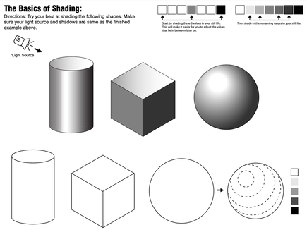
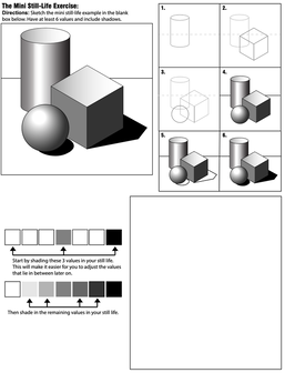
Practise what you have learnt by completing the shading worksheets
Practise what you have learnt by completing the shading worksheets
|
|
Part 2
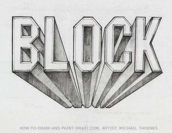
- Find your one point perspective name drawing
- Then apply shading to each letter of your name
- This will help turn your letters from flat shapes into 3D forms
Extension:
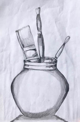
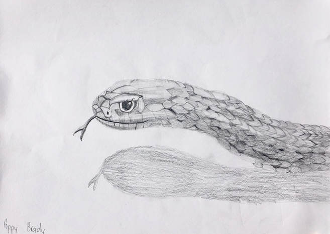
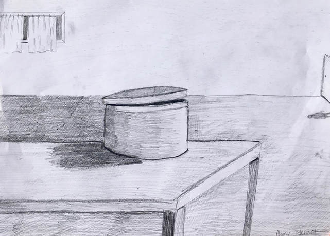
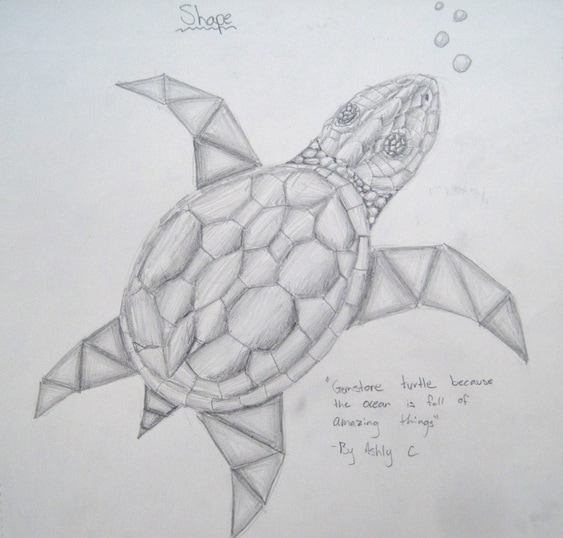
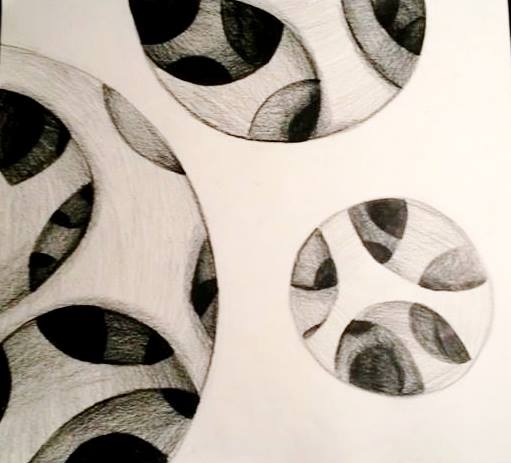
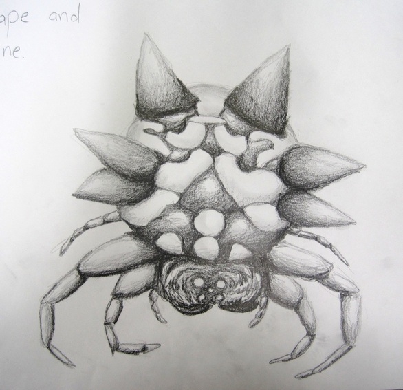
3. Create a drawing using a series of shapes. It can be abstract or realistic. Look at the examples below for ideas.
4.
3. Create a drawing using a series of shapes. It can be abstract or realistic. Look at the examples below for ideas.
4.
- Treat each shape individually and apply value /tone.
- You will need to establish a light source to help you put your highlights, mid tones, dark tones and shadows in the right places.
- Make sure you have the full value range included in your drawing!
- Contrast is your friend to emphasise parts of the image.
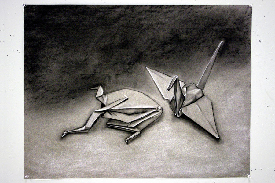
Student Examples